Business Pitch Deck 101

A pitch deck is a brief presentation of your business. To engage investors and gain their support your pitch deck should include these do’s and don’ts.
26 June 2019 by
If you are looking to raise funds for your start-up the first step is to create a pitch deck. Often created on PowerPoint, Keynote or Prezi and used in face-to-face meetings to give investors a better look into your business plan. A pitch deck will engage investors in your idea and hopefully then fund it. A pitch deck is a brief presentation on your start-up that will give investors an overview of your product or business idea. Investors are more likely to approach your start-up if your pitch deck is persuasive, informative and relatable.
A pitch deck is a quick overview of your business plan, you want it to be straight to the point yet engaging. Breakdown your business to its simplest form and allow your product to showcase itself. Have a clear value proposition to customers and investors. You should include your business’s vision and mission this way you will be able to engage investors emotionally, tell them a story about how your product will serve and what it hopes to do in the future. If investors can connect your business to their lives personally they are more likely to act on it.
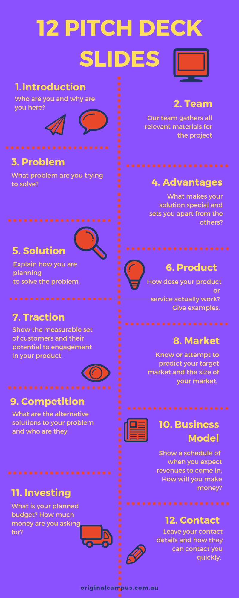
Your pitch deck is the bridge between your idea and investors, it needs to include facts and strategies for your business. You want to be able to show your product or service, then sell your product or service. You will need to include strategies and plans for how your business will go from start-up to thriving. Investors rely on numbers and facts so make sure you include your targeted market and predictions for the future. What to include….

When putting your pitch deck together you want it to be short and simple. No more than 12-15 slides. Include only one idea per slide, this way your audience will stay on the same page as you. Keep the styling of your pitch deck simple so it does not distract them from what you are talking about. A good idea is to be consistent with your branding and especially your brands colour. This will help investors remember you. Use easy to follow text and include graphs, charts and bullet points to help visualise financial growth and market percentages. The use of graphics will engage your investors and easily allow them to better understand what you are saying. It is better to show rather than talk the whole time.
Do
-
Keep it short
-
Include your team
-
Use facts
-
Make it engaging and persuasive
-
Clear and simple
-
Easy to act on
- Know your metrics
Don’t
-
Use too many bullet points
-
Read from a script
-
Crowd your slides
-
Use small fonts
- Unable to answer questions
There are many templates online to help and keep you on track. Check out this one from PITCHdeck Or Startup Science
If you still need some inspiration here are some world class pitch decks that started multimillion-dollar companies.